01.Unpacking the gap between linguistic theory & design students
During a lecture on principles of conversation design, I noticed that my classmates and I could sense when a conversational AI reply was off, but the theories that explain why were detached from real examples.
If designers can't see the nuance in AI conversations, they risk building experiences that feel off to the people using them. Students needed different things: some wanted to understand why one exchange felt off, others wanted to learn conversation design more thoroughly.
How might we make linguistic theory understandable for design students, so they can tell why an AI reply feels off and apply it in their work?
02.Testing an early dashboard prototype with designers
To help designers see why an AI reply feels off, the explanation had to come from real linguistic theory but still easy to understand.
I built a high-fidelity prototype that used a system prompt to score a human-AI transcript on six metrics, each from a published theory: politeness, speech acts, conversation analysis, implicature, discourse analysis and accommodation.
Can a little humor make theory feel less like homework?
Linguistic theory can feel heavy to design students, so I made the product playful enough to feel safe to explore. It's a “science lab” that features a comedic tone and identity inspired by cartoons and video games.
Once the initial prototype was ready, I took it to 3 UX designers for testing.
Analysis dashboard
Deep dive modal
03.Using progressive disclosure to simplify complexity
Testing revealed two barriers to adoption: theory that felt abstract and unfamiliar, and walls of text that caused information overload.
In response, each conversation becomes a simple “vibe” first, and the dashboard opens with one key moment and a visualization of the flow. In the transcript below, the main drivers of the “vibe” are highlighted. Users can hover over a highlight for a quick look at the theory behind it, or open a deep dive that traces the theory back to its empirical source.
The dashboard
1Key moment
Understand a key moment in the conversation quickly
2Flow
Visualize the balance between humans and AI
3The transcript
Show the key patterns and let designers check the reasoning
4Key formulations
3 lines that embody the “vibe”, color coded in the transcript
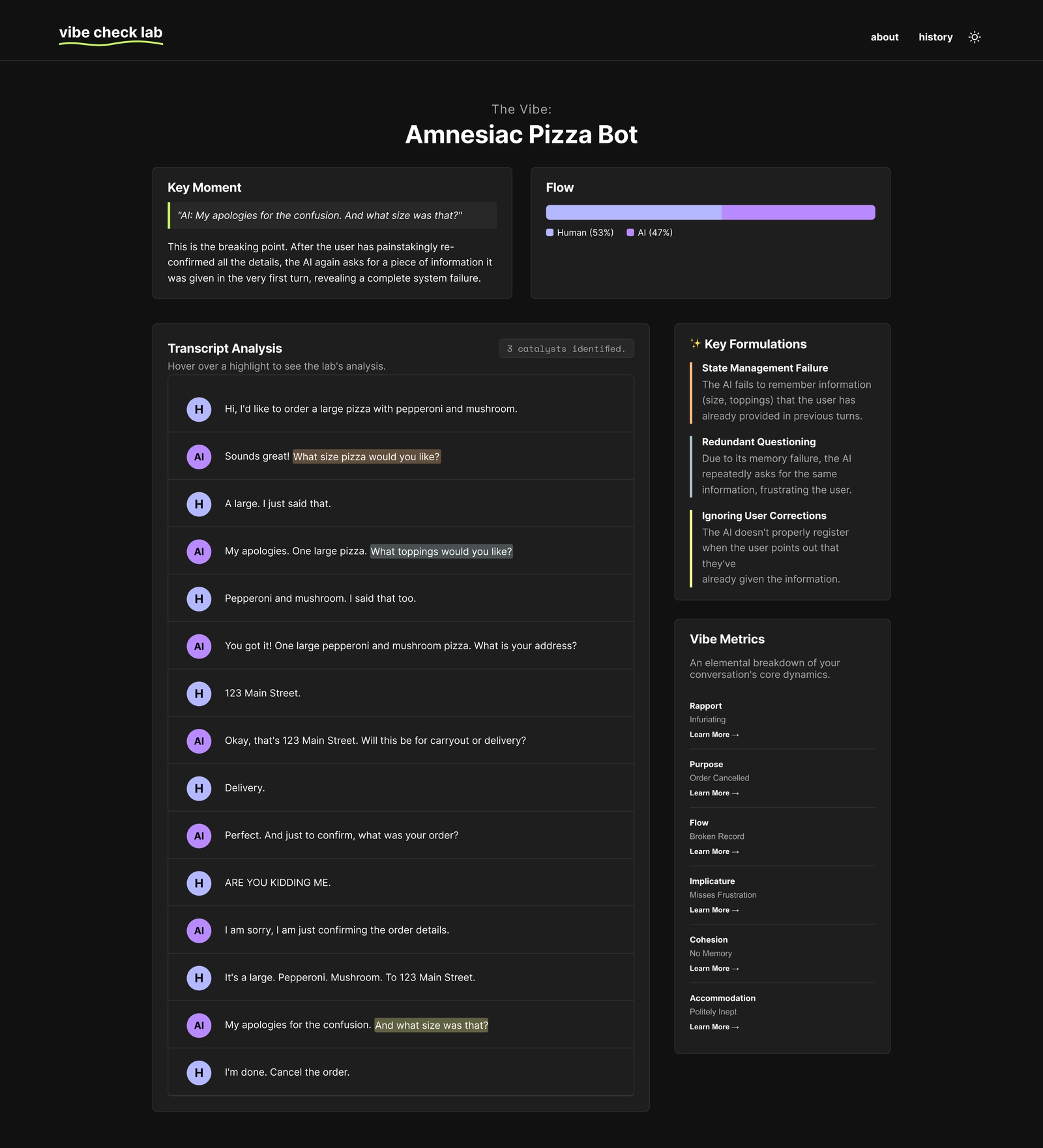
5The library
The variety of theories at a glance
6The deep dive
“Learn More” connects theory to the transcript
7Hover highlight
Hover a highlight to see why it matters
04.Reflection
On similar projects, I would build a lower-fidelity prototype first and bring it to users sooner, then build out the high-fidelity version from their feedback.
If I were continuing, I’d improve the evaluation by:
- Auditing with experts. Have conversation designers audit the AI’s scores on edge cases like sarcasm, cultural slang and high-stakes interactions, where text alone hides nuance.
- Incorporating task performance. An exchange can succeed at the task and still feel off, or the reverse.